Serena's Porfolio
Classwork for BIMM143
Class 5: Data Viz with ggplot
Serena Quezada (PID: A18556865)
Today we are exploring the ggplot package and how to make nice figures in R.
There are lots of ways to make figures and plot in R. These include:
- so called “base” R
- and add on packages like ggplot2
Here is a simple “base” R plot
head(cars)
  speed dist
1     4    2
2     4   10
3     7    4
4     7   22
5     8   16
6     9   10
We can simply pass to the ‘plot()’ function
plot(cars)
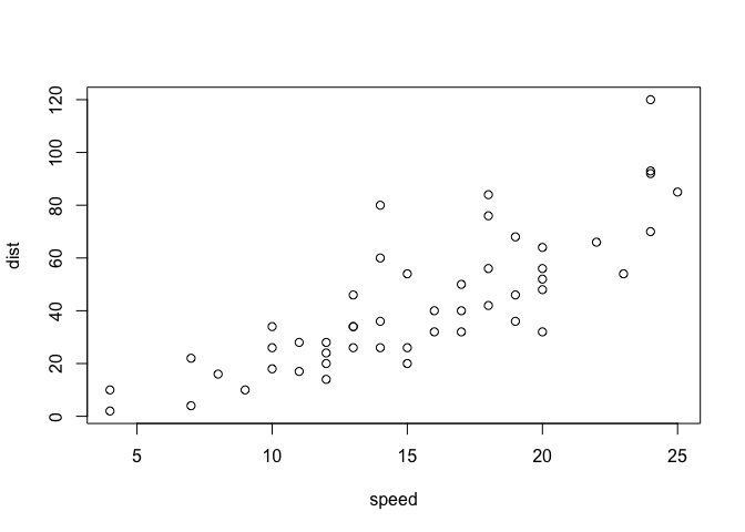
key-point: Base R is quick but not so nice looking in some folks eyes.
Let’s see how we can plot this with ggplot2…
1st I need to install this add-on package. For this we use the
install.package() function - WE DO THIS IN THE CONSOLE, NOT our
report. This is a one time only deal.
2nd we need to load the package with the library() function every time
we want to use it.
library(ggplot2)
ggplot(cars)

Every ggplot is composed of at least 3 layers:
- data (i.e a data.frame with the things you want to plot)
- aesthetics aes() that map the columns of data to your plot features (i.e. aesthetics)
- geoms like geom_points() that sort how the plot appears
ggplot(cars) +
  aes(x=speed, y=dist) +
  geom_point()
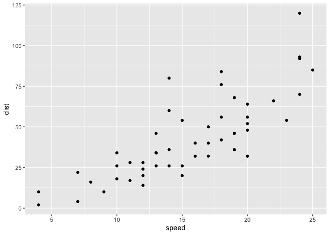
Key point: For simple “canned” graphs base R is quicker but as things get more custom and eloborate then ggplot wins out…
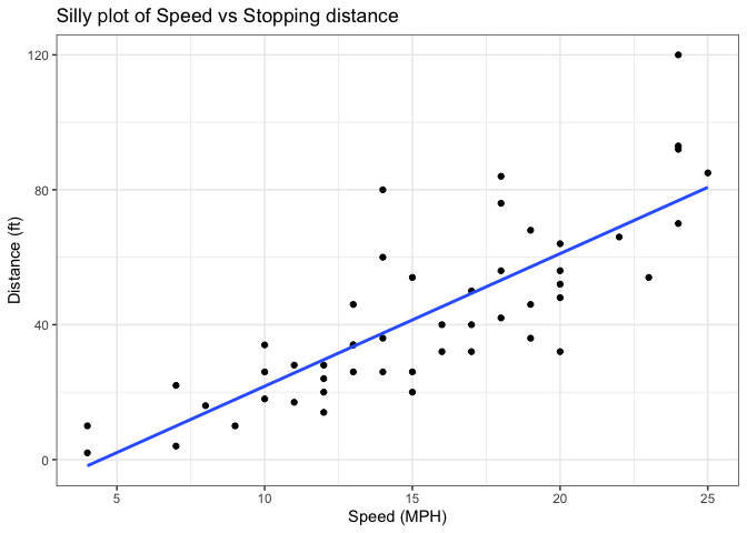
Let’s add more layers to our ggplot
Add a line showing the relationship between x and y Add a line showing the relationship between x and y Add a title Add a custom axis labels “Speed (MPH)” and “Distance (ft)” Change the theme
ggplot(cars) +
  aes(x=speed, y=dist) +
  geom_point() +
  geom_smooth(method = "lm", se=FALSE) +
  labs(title = "Silly plot of Speed vs Stopping distance", x = "Speed (MPH)", y = "Distance (ft)") +
  theme_bw()
`geom_smooth()` using formula = 'y ~ x'
Going further
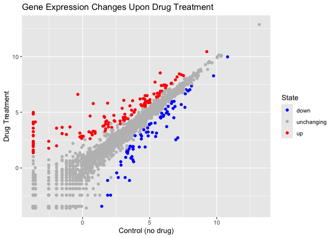
Read some gene expression data
url <- "https://bioboot.github.io/bimm143_S20/class-material/up_down_expression.txt"
genes <- read.delim(url)
head(genes)
        Gene Condition1 Condition2      State
1      A4GNT -3.6808610 -3.4401355 unchanging
2       AAAS  4.5479580  4.3864126 unchanging
3      AASDH  3.7190695  3.4787276 unchanging
4       AATF  5.0784720  5.0151916 unchanging
5       AATK  0.4711421  0.5598642 unchanging
6 AB015752.4 -3.6808610 -3.5921390 unchanging
Q1. How many genes are in this wee dataset?
nrow(genes)
[1] 5196
ncol(genes)
[1] 4
Q2. How many “up” regulated genes are there?
sum( genes$State == "up" )
[1] 127
A useful function for counting up occurances of things in a vector is
the table() function.
table(genes$State)
      down unchanging         up
        72       4997        127
Make a v1 figure
ggplot(genes) +
  aes(x = Condition1,
      y = Condition2, col=State) +
  geom_point() +
  scale_colour_manual( values = c("blue", "gray", "red")) +
  labs(title = "Gene Expression Changes Upon Drug Treatment", x = "Control (no drug)", y = "Drug Treatment")
More Plotting
Read in the gapminder dataset
# File location online
url <- "https://raw.githubusercontent.com/jennybc/gapminder/master/inst/extdata/gapminder.tsv"

gapminder <- read.delim(url)
Let’s have a wee peak
head(gapminder, 3)
      country continent year lifeExp      pop gdpPercap
1 Afghanistan      Asia 1952  28.801  8425333  779.4453
2 Afghanistan      Asia 1957  30.332  9240934  820.8530
3 Afghanistan      Asia 1962  31.997 10267083  853.1007
tail(gapminder, 3)
      country continent year lifeExp      pop gdpPercap
1702 Zimbabwe    Africa 1997  46.809 11404948  792.4500
1703 Zimbabwe    Africa 2002  39.989 11926563  672.0386
1704 Zimbabwe    Africa 2007  43.487 12311143  469.7093
Q4. How many different country values are in this data set?
length(table(gapminder$country))
[1] 142
Q5. How many different continent values are in this dataset.
length(table(gapminder$continent))
[1] 5
unique(gapminder$continent)
[1] "Asia" "Europe" "Africa" "Americas" "Oceania"
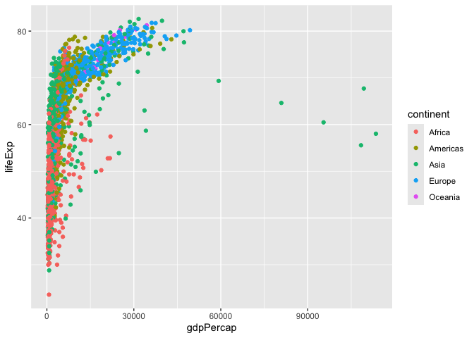
ggplot(gapminder) +
  aes( x=gdpPercap, y=lifeExp, col=continent, label=country) +
  geom_point()
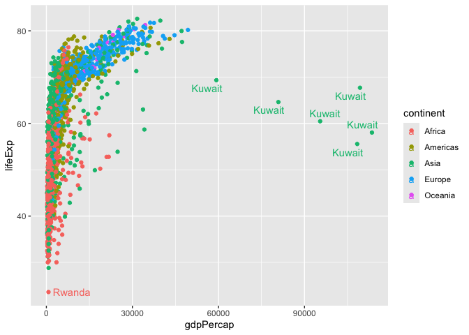
I can use the ggrepl package to make more sensible labels here. Add on package install.packages(“ggrepel”)
library(ggrepel)

ggplot(gapminder) +
  aes( x=gdpPercap, y=lifeExp, col=continent, label=country) +
  geom_point() +
  geom_text_repel()
Warning: ggrepel: 1697 unlabeled data points (too many overlaps). Consider
increasing max.overlaps
facet_wrap(~continent)
<ggproto object: Class FacetWrap, Facet, gg>
    attach_axes: function
    attach_strips: function
    compute_layout: function
    draw_back: function
    draw_front: function
    draw_labels: function
    draw_panel_content: function
    draw_panels: function
    finish_data: function
    format_strip_labels: function
    init_gtable: function
    init_scales: function
    map_data: function
    params: list
    set_panel_size: function
    setup_data: function
    setup_panel_params: function
    setup_params: function
    shrink: TRUE
    train_scales: function
    vars: function
    super:  <ggproto object: Class FacetWrap, Facet, gg>
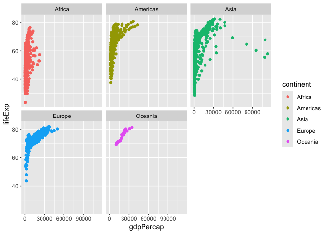
I want a separate pannel per continent
ggplot(gapminder)+
  aes(x=gdpPercap, y=lifeExp, col=continent, label=country) +
  geom_point() +
  facet_wrap(~continent)
Summary
What are the main advantages of ggplot over base R plot are:
-
Layered construction – You build a plot by adding independent layers (geom_point(), geom_line(), geom_smooth(), etc.). This makes it easy to modify or extend a figure without rewriting the whole plot command.
-
Consistent aesthetics mapping – Variables are mapped once in aes(). All subsequent geoms automatically inherit those mappings, reducing duplication and the risk of mismatched axes or colours.
-
Built‑in themes and themes‑by‑default – Nice default styling (grid lines, axis ticks, font choices) is provided out of the box, and you can swap themes (theme_minimal(), theme_bw(), custom UC SD branding themes) with a single function call.
-
Facetting for multi‑panel plots – facet_wrap() and facet_grid() split data into a matrix of small multiples with minimal code, a common need for exploratory analysis in the health sciences, oceanography, and engineering labs at UC SD.
-
Automatic legend handling – Legends are generated automatically from aesthetic mappings and can be customized or removed with a single argument. In base R you typically build legends manually.
-
Scalable to complex visualizations – Adding statistical transformations (stat_smooth(), stat_summary()) or custom annotations (annotate(), geom_text()) integrates seamlessly because they are just additional layers.
-
Publication‑ready output – ggplot objects can be saved directly to high‑resolution PDFs, SVGs, or PNGs with precise control over dimensions and DPI, matching the strict formatting requirements of UC SD faculty journals and conference posters.
-
Extensible ecosystem – Hundreds of extension packages (e.g., ggpubr, ggforce, ggraph) provide specialized geoms, coordinate systems, and statistical tools that are not available in base graphics without writing custom functions.
-
Reproducibility and scripting – Because a ggplot is a single R object, you can store it, modify it later, or render it in different output formats (R Markdown, Shiny apps) without re‑creating the plot from scratch.